Simple outlook inbox analysis using R

Emails from eBay members asking questions come through as randomstring@members.ebay.com which can make them hard to count as a group
The following R script re-codes them so they can be counted.

install.packages("plyr")
library(plyr)

setwd("/home/mike/Desktop")
dir()
inbox<-read.csv("inbox.TXT", sep="\t")
names(inbox)

inbox$EADD <- ifelse(grepl("members.ebay.co.uk",inbox$From...Address.), 
                      "members.ebay.co.uk" , 
                      c(as.character(inbox$From...Address.)))   

str(inbox)

f <- ddply(inbox,c("EADD"),summarize,N=length(EADD))
plot(f$N)
head(f[order(-f$N),])
str(f)

Once you've identified the biggest culprits, make a rule to move or delete them from your email.

Recoding a factor

When you have N levels of a factor but you would like M (M < N) you need to recode the data set.

when you run str(df) you get an idea that factors are numbered in any vetor or data frame.

We need to use a command to recode the levels. The command you use is ‘levels’:

levels(df$factor)[c(2,4,6,7)] = "Horse Whispering"

Which means: Take levels that have the internal numberings of 2,4,6,7 and convert them to being “Horse Whispering”.
To recode the rest you need to find the internal numbering of the new levels for the df:

levels(df$factor)

because the levels that were formally 2,4,6 and 7 have now been recoded into a single value and you’ll have to adjust the integers that you are using every time you run the command.

Continue on until all the necessary coding has been completed.

To make sure you have recoded properly you should make a copy of the first factor and recode the copy rather than the original. That way you can compare new and old later:

table(df$OrigFactor , df$RecodedFactor)

Which will print out a table of counts for OrigFactor Vs RecodedFactor

ggplot2/qplot basics

Install and load the ggplot2 and Cairo libraries

install.packages(c("ggplot2","Cairo")
library(c(ggplot2,Cairo))

set up some data (or use some real data)

x1<-rnorm(150,mean = rep(1:3, each =50),sd = 0.7)
x2<-rnorm(150,mean = rep(c(1,2,1.5), each = 50),sd = 0.2)
x3<-rnorm(150,mean = rep(c(20,30,3),each = 50)), sd = 0.5)
n3<-rep(c("GRP 01","GRP 02","GRP 03"),each=50)

Here is the command to generate the PNG file, with anti-aliasing:

CairoPNG(filename = "Plot1.png", antialias="subpixel", width = 1000, height=800, units = "px")
{
  qplot(x1,x2, ,color = n3, size = x3)
}
dev.off()

Plot1

or you can split the 3 sections up using:

 qplot(x1,x2, color = n3, facets = .~n3)

Plot2

...and now something similar using GGPLOT2

First thing we need to do is create a dataframe from the four identical length vectors.

df <- data.frame(x1,x2,x3,n3)
colnames(df) <- c("x1","x2","x3","n3")

Some Charting:

g1 <- ggplot(df,aes(x1,x2))
p <- g1 + geom_point(aes(colour=n3), size =3.5) + 
          geom_smooth(method = "lm") +
          theme_bw() 
print(p)

..and a slightly better looking version:

g1 <- ggplot(df,aes(x1,x2))
p  <- g1 + geom_point(aes(colour=n3, size =x3)) + 
           geom_smooth(method = "lm") +
           theme_bw() 
print(p)

Plot3

There you go all good stuff.
Other things to check out: facet_wrap
Some more pretty graphics

treemap in R

library(RODBC)
library(lattice)
library(treemap)

ch<-odbcConnect("mike_db",uid="mike")
c<-sqlQuery(ch, paste("select" 
,"ward,year(end_Dttm) as [year]"
,",sum(datediff(mi,start_Dttm,end_Dttm)/1440.0) as LOS"
,"from [wardstays_examples]"
,"GROUP BY ward ,year(end_Dttm)" 
))
str(c)

treemap (c
         ,index=c("year","ward") # the different levels
         ,vSize = "LOS" # the value on which to scale the squares
         )


GIS in R cran

library(maptools)
library(Cairo)
walesCoast<-readShapeSpatial("Z:/MAPPING DATA/Meridian 2 Shape/data/coast_ln_polyline.shp", proj4string=CRS("+init=epsg:27700"))
walesUA<-readShapeSpatial("Z:/MAPPING DATA/Meridian 2 Shape/data/district_region.shp", proj4string=CRS("+init=epsg:27700"))
x1x2<-c(221000,346594)
y1y2<-c(269406,395000)

plot(walesUA,xaxs="i",yaxs="i",xlim=x1x2,ylim=y1y2,lwd=1)
plot(walesCoast,xaxs="i",yaxs="i",xlim=x1x2,ylim=y1y2,lwd=3,col="red", add=TRUE)

mtext("upvar",side=2,line=2,col=1)
mtext("Bottom",side=1,line=2,col=2)
mtext("Top",side=3,line=2,col=3)
mtext("Right",side=4,line=1,col=4)

R cran Stacked Histograms

Stacking histograms using the lattice library:

library(lattice)
histogram(~X1|V1, data = df0, layout=c(1,2))

Which produces something like this (you’ll need to adjust the layout parameter if there are more factor levels):

Some more options:

histogram(~X1|V1
		, data = df0
		, layout=c(1,2) ##stack them
		, type="count" ##also available are percentage and density 
		, nint=50 ##number of bins
)

Which produces this:


R-Cran Very Basics

Read the clipboard into R:

DataFrame<-read.table("clipboard",headers=TRUE)

Write out the data in a Dataframe into the clipboard:

write.table(DataFrame,"clipboard-2048",sep="\t")

You can use this to paste data into other applications.

Create a DataFrame filled with random data (there may be a shorter way of doing this)

x1<-rnorm(2000,750,55)
x2 <-rnorm(2000,16,100)
df1 <-data.frame(cbind("D",x1,x2))

Here we've used "cbind" which means bind some columns
the data.frame bit seems to convert something into a collection of columns into a DataFrame.

x1<-rnorm(2000,500,155)
x2<-rnorm(2000,250,100)
df2<-data.frame(cbind("A",x1,x2))

Now join them together...

df0<-data.frame(rbind(df1,df2))

Now for some reason we have to convert from factors to numerics...

df0$X1<-as.numeric(as.character(df0$x1))
df0$X2<-as.numeric(as.character(df0$x2))

Notice that we've added two extra columns x1 has been converted into X1 and x2 to X2

str(df0)

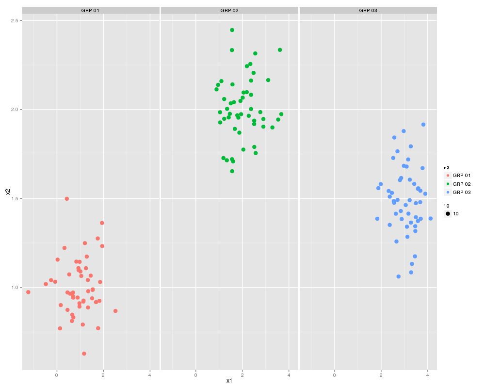
Finally let's plot them:

scatterplot(X1 ~X2 | V1 ,data=df0,smooth=FALSE,ellipse=FALSE,lty=0)

Which will look something like this:

We can also generate a boxplot using:

bwplot(X2~V1,data = df0)
boxplot(X2~V1,data = df0)

bwplot requires the lattice library.

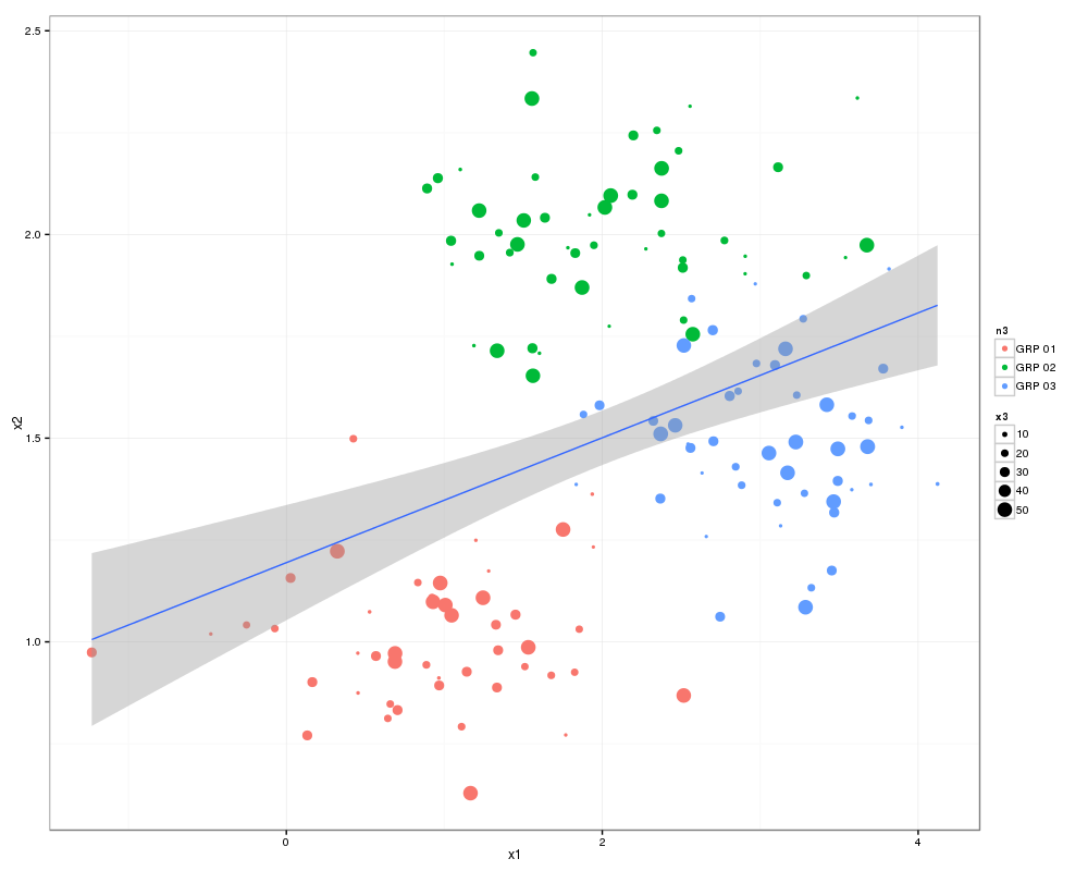
Back to the scatter plot graph:

scatterplot(X1 ~X2 | V1 
		,data=df0
		,smooth=FALSE
		,ellipse=FALSE
		,lty=0
		,grid=TRUE
		,boxplots="xy")

Which gives something like this:

Here the boxplots are describing all of X1 and X2  i.e. X1 of  A  and D combined.