Install and load the ggplot2 and Cairo libraries
install.packages(c("ggplot2","Cairo")
library(c(ggplot2,Cairo))
set up some data (or use some real data)
x1<-rnorm(150,mean = rep(1:3, each =50),sd = 0.7)
x2<-rnorm(150,mean = rep(c(1,2,1.5), each = 50),sd = 0.2)
x3<-rnorm(150,mean = rep(c(20,30,3),each = 50)), sd = 0.5)
n3<-rep(c("GRP 01","GRP 02","GRP 03"),each=50)
Here is the command to generate the PNG file, with anti-aliasing:
CairoPNG(filename = "Plot1.png", antialias="subpixel", width = 1000, height=800, units = "px")
{
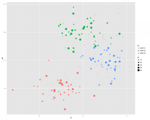
qplot(x1,x2, ,color = n3, size = x3)
}
dev.off()
or you can split the 3 sections up using:
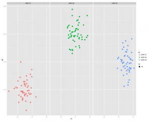
qplot(x1,x2, color = n3, facets = .~n3)
...and now something similar using GGPLOT2
First thing we need to do is create a dataframe from the four identical length vectors.
df <- data.frame(x1,x2,x3,n3)
colnames(df) <- c("x1","x2","x3","n3")
Some Charting:
g1 <- ggplot(df,aes(x1,x2))
p <- g1 + geom_point(aes(colour=n3), size =3.5) +
          geom_smooth(method = "lm") +
          theme_bw()
print(p)
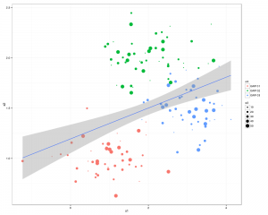
..and a slightly better looking version:
g1 <- ggplot(df,aes(x1,x2))
p  <- g1 + geom_point(aes(colour=n3, size =x3)) +
           geom_smooth(method = "lm") +
           theme_bw()
print(p)
There you go all good stuff.
Other things to check out: facet_wrap
Some more pretty graphics